
Consider it Done Bookkeeping
The Story of Consider It Done Bookkeeping
Redefining Bookkeeping with Style, Clarity, and Confidence
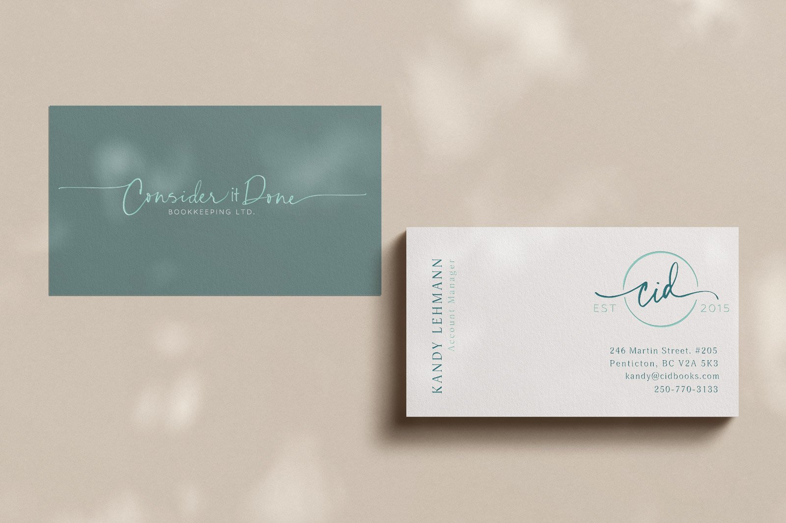
When I partnered with Consider It Done Bookkeeping, the mission was clear: to create a brand identity that broke away from the typical financial firm mold and communicated both expertise and approachability. Rooted in Penticton’s thriving business landscape, CID Books needed visuals that reflected their dedication to transparency and growth—without sacrificing style. We crafted a brand that feels fresh and bold, with clean lines, vibrant hues, and unexpected design elements. The result? A visual language that sets CID Books apart from conventional bookkeeping, showcasing a dynamic and supportive team that brings clarity and confidence to every client.


BUILDING TRUST, ONE NUMBER AT A TIME //
Consider It Done Bookkeeping (CID Books) is built on a foundation of trust, transparency, and community. The team’s mission is to create a supportive and non-judgmental environment where clients feel understood and empowered. With its roots firmly planted in Penticton, CID Books is more than just a bookkeeping service—it’s a trusted partner in its clients’ journeys toward financial clarity and peace of mind.
CRAFTED FOR CLARITY and CONFIDENCE //
The visual identity of CID Books is anchored in a clean and approachable design that mirrors the company’s values. The primary colour palette consists of shades of calming teal blues, representational of the Okanagan lakes and symbolizing trust and reliability, balanced with fresh, bright accents to convey energy and optimism. This combination reflects CID Books’ commitment to being a steady, dependable presence while bringing new perspectives and solutions to the table.
Typography //
The brand’s typography features a blend of modern sans-serif fonts to communicate professionalism and accessibility. The clean, open style of the fonts emphasizes clarity, making information easy to digest for clients. Paired with minimalistic icons and straightforward layouts, CID Books’ design ensures that every touchpoint is welcoming and free of unnecessary complexity—just like the company’s approach to bookkeeping.
A Community-Centered Approach //
Consider It Done Bookkeeping’s brand isn’t just about numbers; it’s about people. The company’s visual elements are designed to inspire confidence and warmth, with soft gradients and rounded corners that evoke a sense of inclusivity and approachability. This reflects CID Books’ dedication to meeting clients where they are, helping them navigate their financial challenges without judgment.
Crafted to Support Growth //
Every design choice for CID Books aligns with its mission of empowering clients and providing exceptional service. From the logo, which features an open, rounded design symbolizing the company’s open-door policy, to the well-considered layouts and colour choices, the brand is a testament to CID Books’ philosophy of growth through support and understanding.
Kind words from CID BOOKS
"We hired Marina to help us with re-branding, and our website design. Within just a few conversations with Marina we realized that she was the breath of fresh air that we needed, she was able to ask us the right questions and create our logo, website and marketing materials it was exactly what we were looking for.
We love our website so much. It reflects who we are and celebrates all the things we value the most. It is fun and engaging. We could not be happier with what Marina has done for us. Marina is such an amazing and kind hearted person,
we are so excited to continue working with her and seeing what the future holds for all of us."


Let's Work Together
If you have a brand story waiting to be brought to life, I would love to collaborate and create something just as meaningful. Let’s chat about how we can craft your brand’s narrative together.